RSS

Author Archives: Kevin

Before and After – First Floor

Our adventure in home renovation is drawing to an end. The post below is the first of several that will bring closure to the WolfeStreetProject.

This post addresses the end result of renovation on the first floor – subsequent posts will address the second floor and basement (such as it is). We reblogged the “Pinnacle of Destruction” post to provide some context to the scope of the project; the “Destruction” post pretty much applied to all floors, and shows the house at the apex of demolition. Other, relevant, first-floor demolition posts:

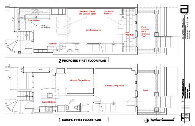
Before demolition actually began, we had developed a plan with our architect for transforming the first floor space. The floor plans for the before (bottom) and after (top) designs for the first floor are presented below.

Additional details on our design goals for the space were posted earlier:

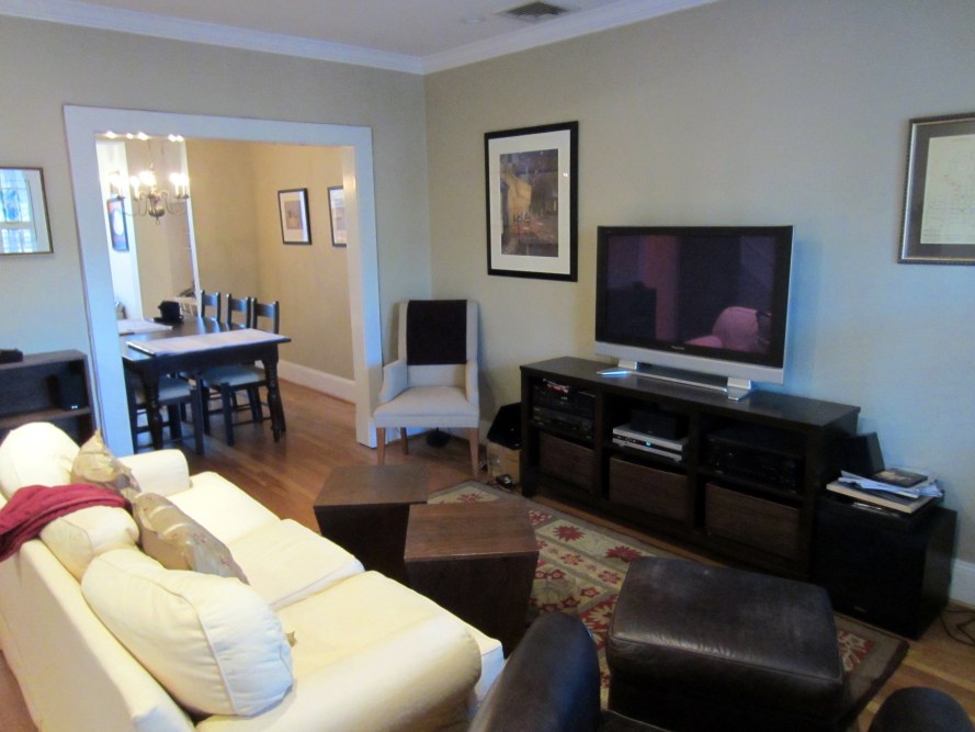
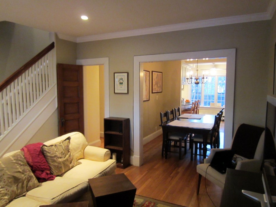
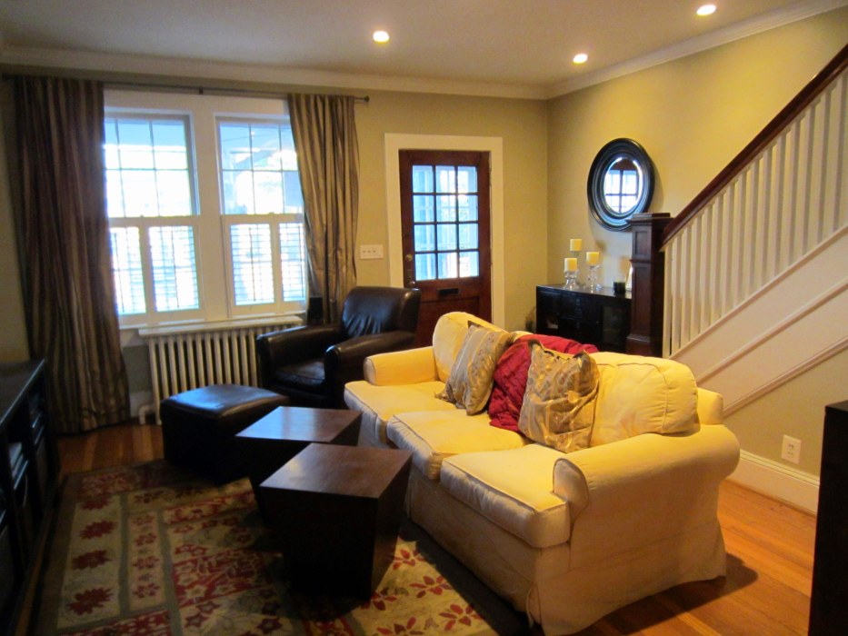
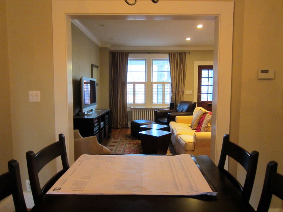
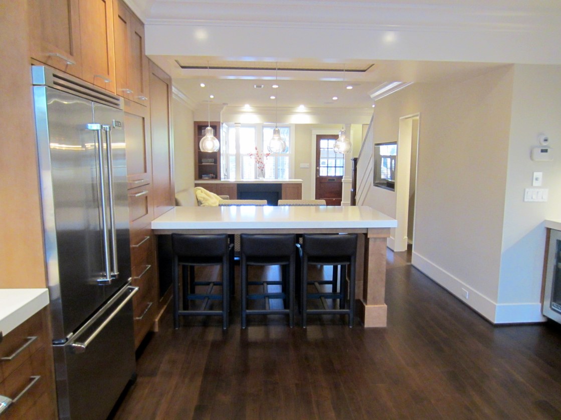
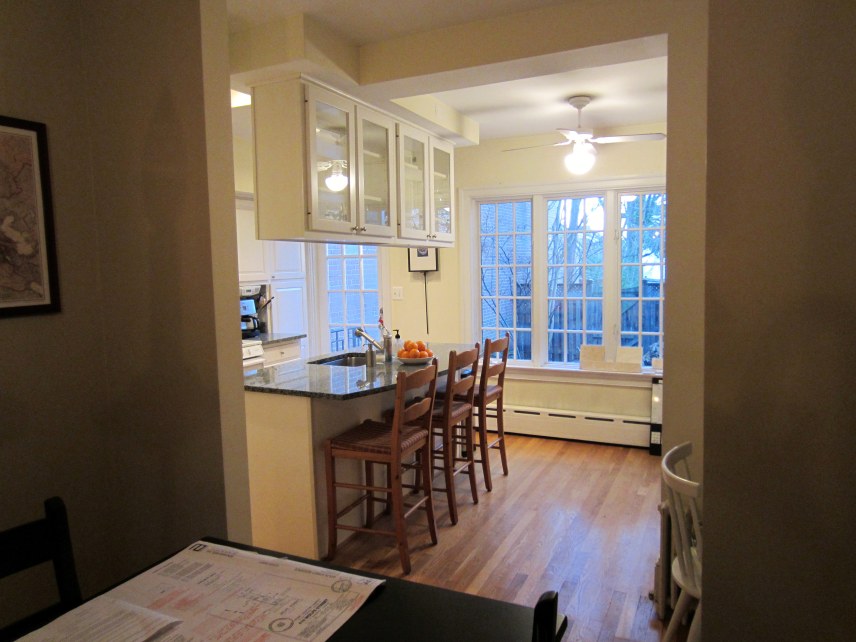
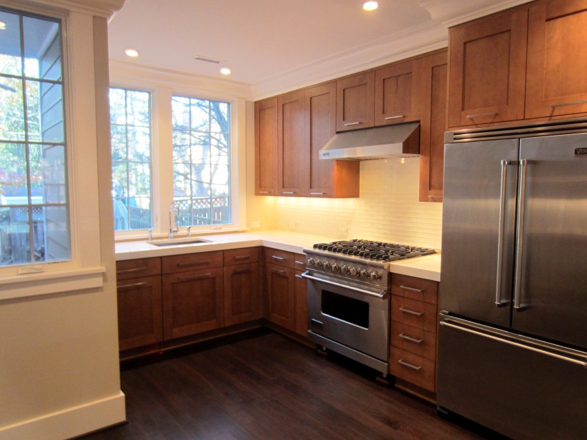
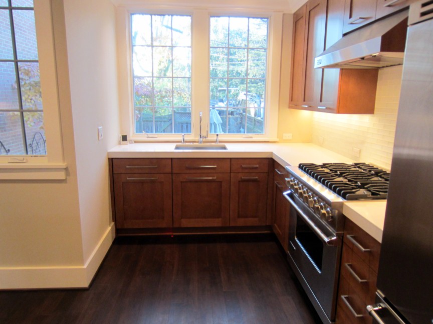
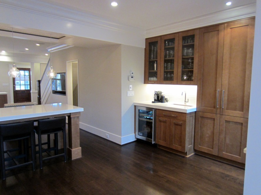
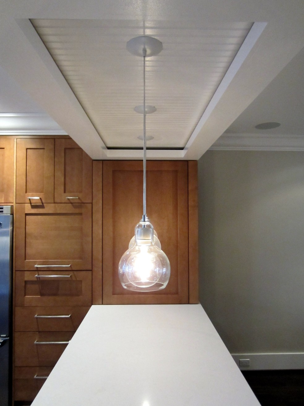
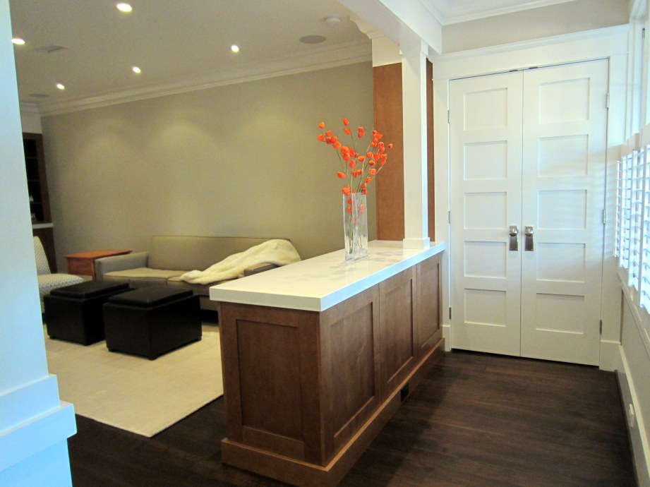
Although we had plenty of unforeseen issues and a few design changes along the way, the trauma and stress of the WolfeStreetProject definitely paid dividends – our design goals and functional living space aspirations, remarkably, were all met. Presented below, with minimal commentary, are before and after pictures of the first floor to provide a view of the final product (albeit without art on the walls, which will become another project . . .).

Before:

After:

Before:

After:

(And even more after, after a few years of living in this space):

IMG_9397

Before:

After:

One of the things you’ll notice is the tremendous increase in ambient light in the house after the renovation. This is the combined effect of the open floor plan and, at the front of the house, the removal of the linen closet on the second floor to blow open the stair well and allow more light to flow from the new, full-length skylight.

Before:

After:

Before:

After:

We only had a few pictures of the kitchen before (other than party pictures, which are included in one of the earlier posts reference above), so there’s not a great alignment with the before and after pics in this area (plus, the space for part of the kitchen didn’t even exist before the renovation . . .).

The kitchen after the renovation:

Before:

After:

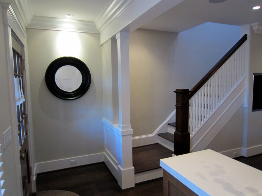
The new vestibule and much-appreciated coat closet:

New landing at the bottom of the original staircase (the only element of the original house retained during renovation):

A view of the split, five-panel powder room door from the top of the basement stairs is below.

Resting on the radiator are a couple of signed plinth blocks. Dave, our Master Carpenter and site foreman throughout the project, and Freddie, Dave’s primary carpenter during the project, signed the blocks for us one day when they were addressing some punch list items:

Dave and Freddie did great work, and the WolfeStreetProject would not have been a success without their skill and craftsmanship. The finish carpentry work and overall fit and finish of the entire place is flawless because of these guys.

Aside from the changes in the overall appearance of the space, there are a multitude of infrastructure improvements that were able to be implemented by taking the whole space down to the bones. These include under-floor hydronic heat on the first floor, updated plumbing, electrical, and mechanical, and integrated AV to eliminate all exposed elements from view, other than the TV. (As you’ll note in a few of the dining peninsula pics above, a black metal grill that we had fabricated worked perfectly in the space under the massive slab o’ quartz to hide the subwoofer.)
 
7 Comments

Posted by on December 2, 2012 in Design


Before and After – Second Floor

The second post to bring closure to the WolfeStreetProject addresses the end result of renovation on the second floor. Before and after photos are presented below; some posts early on in the project documented the demolition of the upper floor (and discussed some of the discoveries of the original house that had been concealed for decades):

Before demolition actually began, we had developed a plan with our architect for transforming the second floor space. When there was a debate about whether we had the space for two bathrooms, Ben asked a great question: “So, let me get this straight, Kevin, you all wake up, Lisa heads to the shower on the second floor, and you head down two flights of stairs to take a shower in the basement?”

The design, including the addition of a second bathroom on the second floor, became pretty clear after that.

The floor plans for the before (bottom) and after (top) designs for the second floor are presented below.

Before and After Second Floor with Notes v2

Unlike the design goal posts for the first floor, we didn’t blog about the goals for transforming the second floor. However, a walkthrough of the second floor during framing, when a visiting building inspector from Pennsylvania was in town for a half marathon with Lisa, provides a brief summary of how the space would be used:

Although we had plenty of unforeseen issues and a few design changes along the way, the trauma and stress of the WolfeStreetProject definitely paid dividends – our design goals and functional living space aspirations, remarkably, were all met. One of the greatest additions (actually, a subtraction) by our second architect, Natalie, was the removal of the linen closet in the stairwell, noted by the red X above.

Presented below, with minimal commentary, are before and after pictures of the second floor to provide a view of the final product.

Master bedroom before:

IMG_2315

IMG_2087

IMG_2091

And, after (the renovation to this space included a 5′ bumpout to the south, a new bathroom, walk-in closet, and en suite washer / dryer):

IMG_4265

IMG_4266

IMG_4267

IMG_4268

IMG_4270

IMG_4272

IMG_4273

IMG_4275

IMG_4276

IMG_4278

IMG_4280

Guest room and second-floor bath before:

IMG_2307

And, after, including Natalie’s brilliant idea to demo the linen closet (RIP, narrowest 5-panel door in the world . . .):

IMG_4261

IMG_4180

Guest room before and after:

IMG_2312

IMG_4184

IMG_4187

IMG_2310

IMG_4182

IMG_4183

Second-floor bath before:

IMG_2296

And, guest bath, after:

IMG_4178

 
Leave a comment

Posted by on November 27, 2012 in Design


Now that the project’s complete, we thought a repost of the house at the height of demolition would provide some interesting retrospective context in advance of the “after” photos.

WolfeStreetProject

For the past 2 weeks, the focus of renovation activities has been destruction, rather than construction. These activities reached terminal velocity on Thursday, February 23, with the removal of most of the joists supporting the second floor. The result, as you’ll see below, is a complete transition of a house (that was, frankly, pretty nice), to an empty hull. In the words of one of our young nieces commenting on the blog, “the house looked so sweet before and now it is a catastrophe!”

The photo below is during the penultimate step of demo. It’s a view from what used to be the dining room, through what used to be the master bedroom floor, to the exposed rafters. The skylight to the left is above the stairs, and will remain (although it’s not original to the house, like the one in the center, above the old bathroom).

Dave, the site…

View original post 454 more words

 
1 Comment

Posted by on November 26, 2012 in Interior Demolition


Surrounded

The last component of the renovation was implemented the Monday of Thanksgiving week, just days before the Thanksgiving Eve party: the fireplace surround. The fireplace itself was installed in July, as documented in this post. After the counter top over the fireplace built-in area was installed, we were able to move forward with installation of the surround.

We chose a black granite that was treated to appear like leather – the surface has been contoured and is pleasing from both an aesthetic and tactile perspective. The design for the surround included the following characteristics:

  • A face that was the same thickness as the cabinet doors, so it would be in the same vertical plane as these elements
  • A base that would extend forward in the same plane and at the same height as the cabinet toe kicks that circumnavigate the built-in cabinets in this area, with a critical functional design element that’s discussed below

The guys from our neighborhood counter top firm ended up coming twice to install – the first time the surround did not fit perfectly, plus, the lead installer identified a structural enhancement that would address a stability risk that existed if we just adhered the face to the fireplace frame without any load-bearing by the floor.

The finished product worked out perfectly. All of the new, stone surfaces are aligned with the existing wood cabinetry, exactly as designed.

The functional element of the design referenced above was a 3/8″ gap between the bottom of the surround and the floor. This subtle gap is sufficient to provide the oxygen supply to the gas fireplace without distracting from the overall aesthetics of the surround.

 
2 Comments

Posted by on November 25, 2012 in Fireplace


Wining and Dining: Opining on Design Refining

It’s now mid-November, and the house is basically done. We moved back into the house at the end of August, but stopped posting because we hit the 90% completion point, and most of the changes since have been incremental, and less dramatic than earlier stages of the project. We’ll be posting pics of the completed house after the Thanksgiving holiday festivities (and the annual Thanksgiving Eve party), but did want to post one update before then – construction of the dining peninsula.

As noted in the first floor design post, one of the objectives of the open-plan first floor design was to eliminate the dining room (which we rarely used, and simply walked around each day) and replace this with a dining element that would better support how we live and how houses these days generally function, from a social perspective. Namely, an area that explicitly accommodated guests aggregating in the kitchen, which is where everyone ends up, regardless of intent.

The overall vision for the peninsula is presented in 3D below, from our design work with Ben in 2011, before renovation actually began (check out the crazy thin-ass crown molding!):

In a photo from August 2012, after cabinets have been installed, but before the peninsula itself, we clearly maintained fidelity with the design:

However, reaching this stage prompted some serious work – we needed to figure out how to insert and support a 600-lb slab of 2.5″-thick quartz counter top into the picture. The actual mechanics for doing this were never really addressed during design, so the time had come to tackle this challenge.

The first action was, as always, an excellent drawing from Natalie. Just like with her bulkhead detail, this helped establish the parameters for everyone.

Her sketch below described the relative relationship of all elements for the parties involved – the GC, a custom metal fabricator we hired, and the counter top purveyor. The design on the top portion of the sketch addresses the relative position of the metal frame to the edge of the counter top – one side will extend farther than the other to allow for a 3/4″ overhang on the living room side of the peninsula, consistent with the overhang on the fireplace counter top on the other side of the room:

The next step was to install the peninsula legs, which would need to integrate with the metal frame, and support half the weight of the quartz. The 6″ x 6″ legs were fabricated by our kitchen cabinet maker and installed by our awesome carpenters with the GC – Dave and Freddie. The guys cut holes in the protective floor covering, measured the inside openings of the legs, and cut blocking and bolted these into the floor to serve as the foundations for the legs:

The next step (I think we’re up to Step No. 3, now), was to work with the metal fabricator to design and fabricate a metal frame that would be secured to the brick wall on one side and our new peninsula legs on the other, to support the counter top. (As Alexandria residents, we’re pleased to report that we were able to source everything locally – the metal fabricator, the counter top purveyor, and the GC are all local Alexandria businesses.)

Unlike most counter tops, which are supported along their entire lengths by underlying cabinets, our dining peninsula counter top would need to span an unsupported 6.5′ chasm – and not crack. The metal fabricator’s plan for the metal framework that would support the slab is provided below. The yellow elements are the steel frame; the red (pink? puce?) elements are cabinetry (cross-section of the apron on the bottom left and cross-section of a leg on the bottom right – obviously in different scales):


As you’ll note in the sketch above, one of the elements was the inclusion of tabs off the frame. This would allow the wood apron to be installed by the GC.

On the appointed day in August, the fabricator arrived and successfully installed the steel frame. It’s bolted into the masonry of the West wall on one end (it just “kisses” the cabinet below, in the parlance of the firm’s owner) and into the legs on the other end:

They used a “laser” to level the frame – Dr. Evil would be proud:

Note the void in the cabinet against the wall in the photo above. This will be filled by a subwoofer, and a grill will be installed in the cabinet frame to conceal this AV element, but still allow its sonic contribution to our music and video experiences.

The metal fabricator’s mission has been accomplished. Now, to trim out the elements. In the photo below, Freddie installs the cabinet baseboard to each of the legs:

In the photo below, the maple apron (mapron?) has now been installed around the circumference of the frame.

IMG_4095

Now for the counter top design:

Counter top arrival day: the guys from our local counter top firm (they also did our old kitchen, as well as the radiator top in the old living room) arrive to haul in the big-ass slab of dining peninsula goodness.

The three guys had a hell of a time with this mother. I thought I might need to give one of them my hernia doctor’s info at one point.

Just slide that baby in, and we’ll all be good:

Fantastic! Looking good:

Um . . . wait . . .

This big-ass slab is 1″ short!

So, here’s the deal: something went awry with the measurement and templating, and our honkin’ slab o’ quartz is, literally, 1″ short of the proper length. Luckily, our counter top firm was (as all Alexandrians are) completely awesome and responsible. We discussed the issue, and they removed the slab and started over.

Counter top delivery, Part Deux:

Hernias averted – four guys this time.

The slab fits, and the guys epoxy the quartz to the frame to create a bond that will enable the two elements to become one, and avoid crackiness.

The result was perfect. This outcome, as well as a broad range of other elements in the finally renovated domicile will be posted after Thanksgiving.

Connell fam, Quicks, Florida Connells, Thomas, et al. – see you in a few days for the Thanksgiving Eve feast-o-rama on Wolfe Street!

 
1 Comment

Posted by on November 18, 2012 in Design, Kitchen


Getting Busy in the Backyard

As indicated in the kitchen design post, one of the changes we made midway through the design process was to increase the size of the range in the kitchen from 30″ to 36″. While the result shown below was a good thing:

. . . the unintended byproduct–an oversize steel carbuncle of a vent sprouting from the back of the house–was not:

Not only did the larger range size result in a larger vent, the vent placement created a conflict with the downspout, which was to run down the corner of the two houses. The plans called for a 4″-diameter, round downspout, but only 3″ of clearance remained after the big-ass vent elbowed its way onto the back of our house.

We couldn’t use a smaller diameter, round downspout due to the volume of runoff from the roof, so we were kinda screwed here. We could route a 4″ pipe down the corner, around the vent, and back down the corner, which would look ridiculous, or we could route the 4″ pipe straight down the side of our neighbor’s house far enough out to clear the vent, which would not only look ridiculous but also would likely not sit well with the neighbor.

As a result, we considered running the downspout on the other side of the house, down the new pillar to the right in the picture above, and directing runoff into a small planter area behind our outdoor couch. However, the GC was concerned that the city would reject this runoff rerouting and require us to reverse this. (Although living in Old Town is generally great, it does become mildly Orwellian at times like this, what with the Ministry of Arcane Permitting intruding into every aspect of a home renovation project . . .)

So, the GC’s exterior sub came up with a much better solution – a custom, rectangular, 3″ x 4″ downspout that would slot neatly between the corner and the vent and that would provide adequate capacity for the roof runoff. It worked beautifully:

The downspout also fit nicely to the west of the electrical meter:

You’ll note that the downspout terminates in a mass of conduit that we installed when the backyard was hardscaped in 2007:

One of the challenges we faced during the renovation was addressing these conduits and their functions, since they previously saw daylight in the small alcove between the two houses:

This little alcove previously was hidden from view. However, with the renovation, this alcove no longer exists, and we need to address routing and termination of the conduits and their contents. The conduits were exposed and cut down during the excavation stage of the project, as posted here. The exposed conduit functions include the following:

In addressing the issue, the guys approached the conduit the same way as with interior infrastructure elements – biggest first. The largest pipe was the drain line for the downspout, so this was angled west and connected.

The others were extended and routed so they would all snug up against the house to the west of the window (below a future exterior outlet and hose bib) and so they were tightly clustered together.

Because the black gas line conduit was being used to route cable to the outdoor TV, and because cable lines would enter and exit the house on the other side of the electrical panel, this was moved to the other side of its brethren before finalizing the arrangement and cement was poured.

Natalie’s hand-drawn plan for routing the pipes is in the foreground, marked up in red where we just changed the location of the outlet and hose bib from the white trim to the cement wall below.

Cement has now been poured, sealing in the conduit placement:

Next step is replacement of the flagstones in this area, parging the cement walls, and installing the outlet and hose bib.

 
2 Comments

Posted by on August 5, 2012 in Exterior


Another Tilestone Met

While the master bath was being re-tiled, work on the guest bath was halted. Now that the master bath is back in shape, the guys resumed work, ultimately meeting the completion milestone, albeit a bit late. Over the last couple of weeks, not only was the tiling complete, but fixtures began to appear:

 
1 Comment

Posted by on August 4, 2012 in Bathrooms


Installation of First-Floor Fireplace

While awaiting installation of the quartz counter tops, the fireplace installation vendor popped in the Spark fireplace, which is embedded in the built-in cabinets at the front of the house:

 
2 Comments

Posted by on July 31, 2012 in Fireplace


Gettin’ Down with the Crown

Now that the kitchen cabinets and built-ins at the front of the house have been installed, we were able to proceed with installation of the remainder of the crown molding on the first floor. This bit of trim was the subject of lively debate among (and between) us, the GC, our first architect, Ben, and our current architect, Natalie. Basically, the molding spec’d by Ben in the plans turned out to be humongous.

The GC was so skeptical about the selection that Dave sent me the following picture one day to confirm that this was really the stuff we wanted to install:

Frankly, we really didn’t know whether this was, indeed, what we wanted. The questions from the GC and the noble attempts by Natalie to identify an alternative drove us to reconsider the molding. This is how the crown molding was spec’d in the first floor living area elevation:

The key element is the scale of the molding relative to the beam up front and the bulkhead at the back (the top elevations in the plan above). The molding lends weight and substance to these elements, and our discussions with Ben affirmed this.

Moreover, based on our interest in having windows as tall as possible, the crown was selected to descend from the ceiling to the top of the windows, with no casing. If we went with smaller crown, the space between the bottom of the crown and the top of the windows would be awkward.

Yet, still, we questioned the choice, to the point of checking out the look one night after work to try to resolve our angst:

In the end, we trusted the initial design. Good thing – it worked out perfectly. This is the scene right before the molding started snaking across the ceiling:

And after:

 
2 Comments

Posted by on July 30, 2012 in Trim, Casing, and Doors


Tile and Error

While we were away, the first floor was proceeding swimmingly, but we did receive a disconcerting call regarding the master bath, which had been completely tiled before we left. The tiles were, uh, falling off. Because the Crema Ella marble was honed on both sides (rather than honed on one side and rough on the other), the thin-coat mortar didn’t fully adhere.

So, Mario and the tile crew had to pull 100% of the tile off the wall, cut more due to damage, and reinstall the entire space using an epoxy adhesive.

Reinstallation nears completion:

The joints on the north wall were grouted first to allow the vanity to be installed.

Grouting was then completed in the rest of the bathroom. Next step: shower doors, glass shelf for niche, and angle and bench installation.

 
1 Comment

Posted by on July 29, 2012 in Bathrooms