RSS

Category Archives: Design

Before and After – First Floor

Our adventure in home renovation is drawing to an end. The post below is the first of several that will bring closure to the WolfeStreetProject.

This post addresses the end result of renovation on the first floor – subsequent posts will address the second floor and basement (such as it is). We reblogged the “Pinnacle of Destruction” post to provide some context to the scope of the project; the “Destruction” post pretty much applied to all floors, and shows the house at the apex of demolition. Other, relevant, first-floor demolition posts:

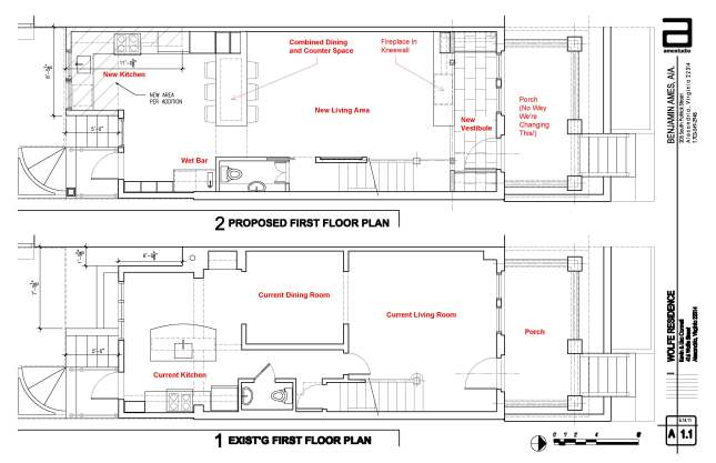
Before demolition actually began, we had developed a plan with our architect for transforming the first floor space. The floor plans for the before (bottom) and after (top) designs for the first floor are presented below.

Additional details on our design goals for the space were posted earlier:

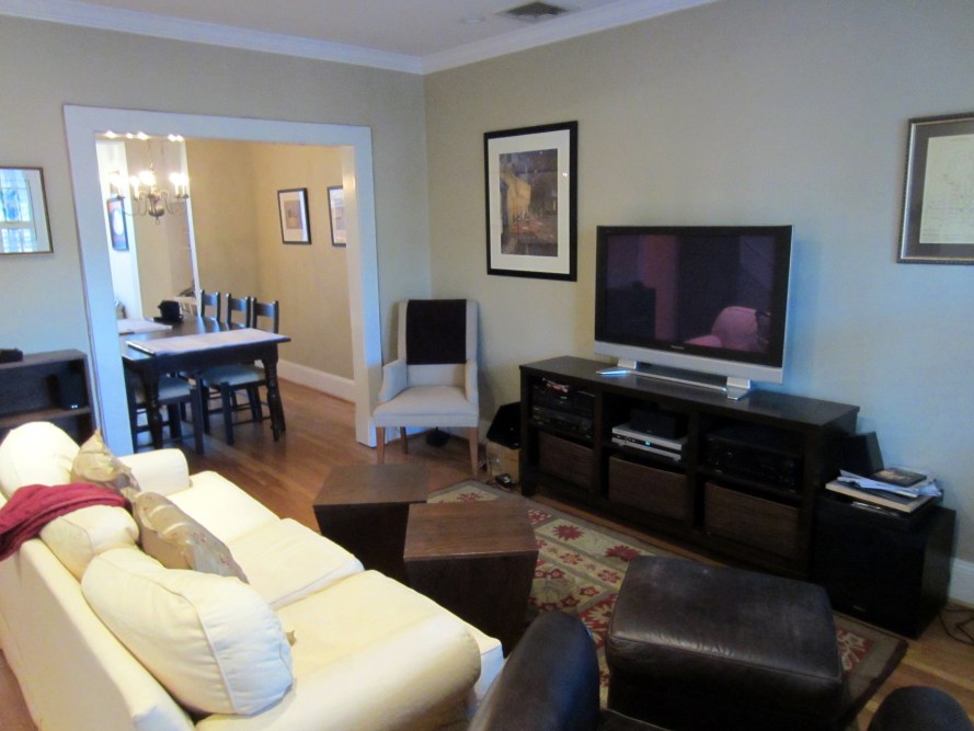
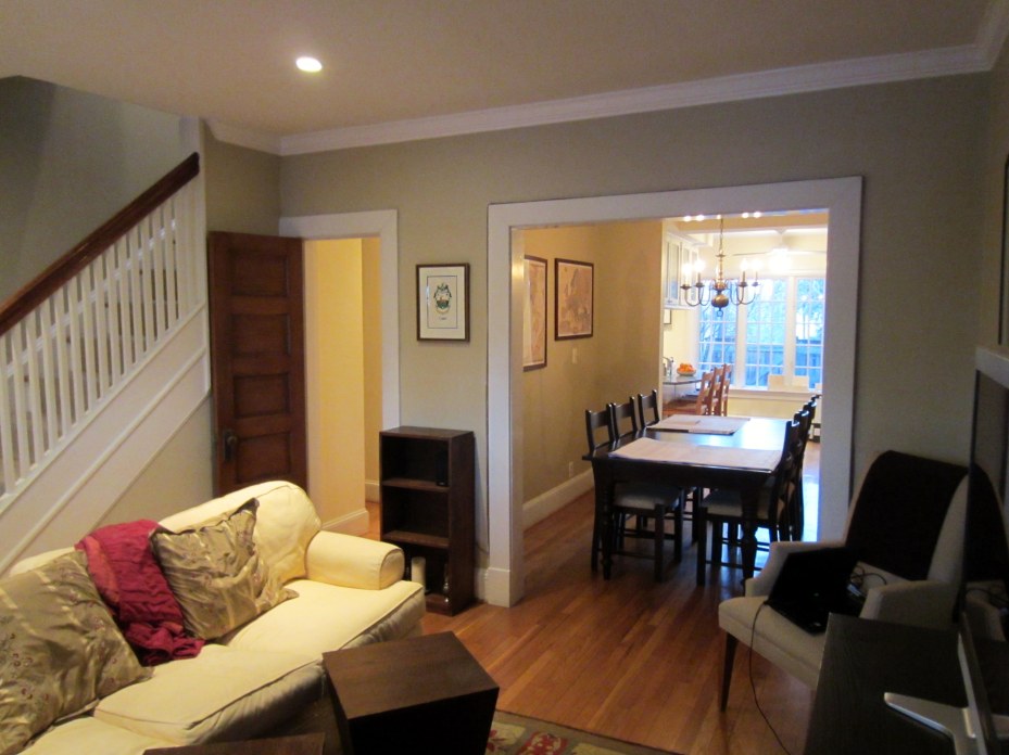
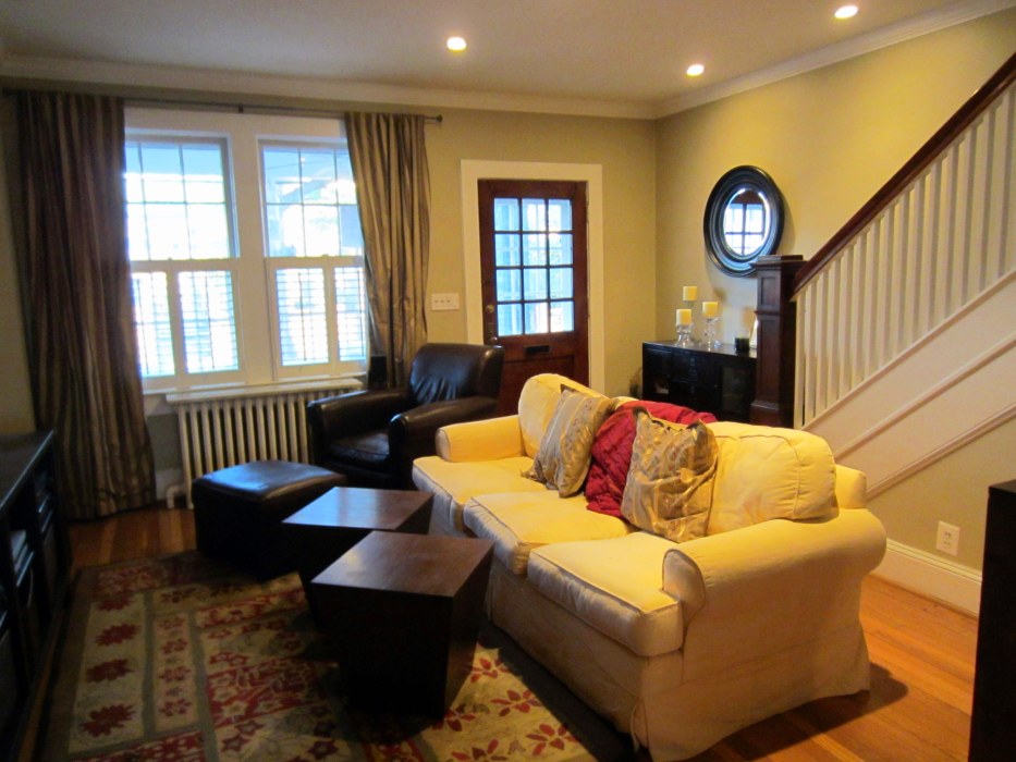
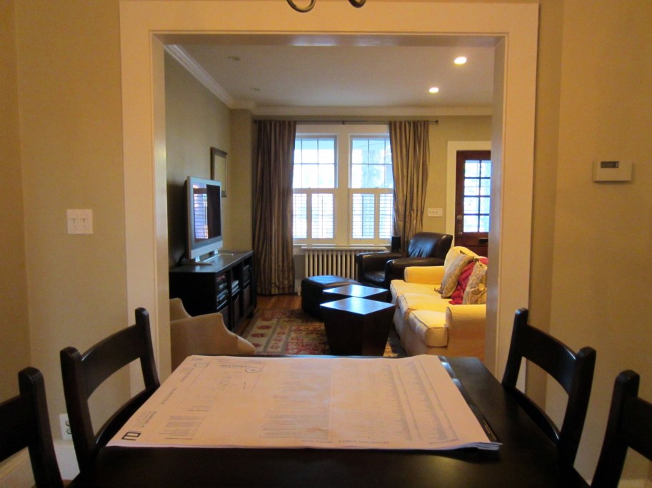
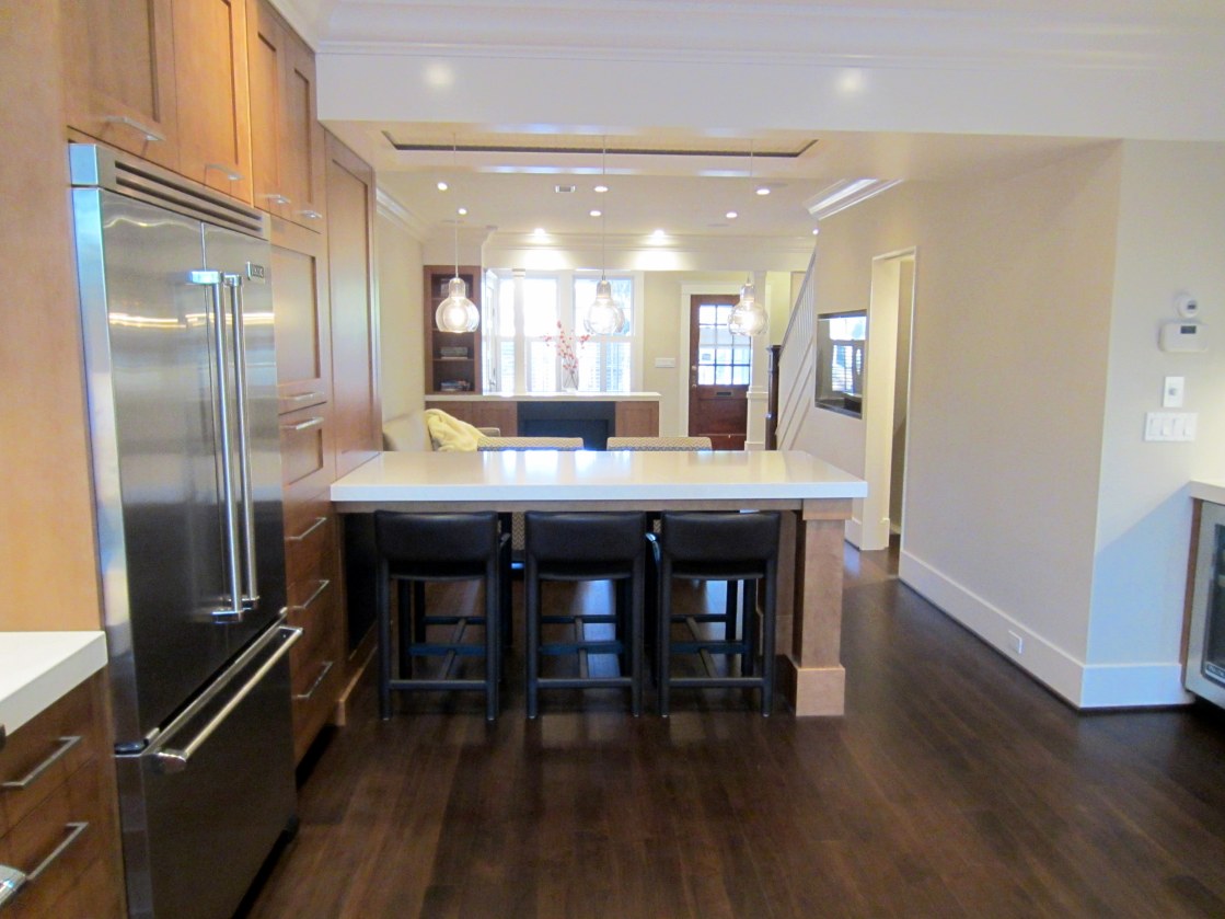
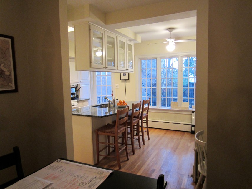
Although we had plenty of unforeseen issues and a few design changes along the way, the trauma and stress of the WolfeStreetProject definitely paid dividends – our design goals and functional living space aspirations, remarkably, were all met. Presented below, with minimal commentary, are before and after pictures of the first floor to provide a view of the final product (albeit without art on the walls, which will become another project . . .).

Before:

After:

Before:

After:

(And even more after, after a few years of living in this space):

IMG_9397

Before:

After:

One of the things you’ll notice is the tremendous increase in ambient light in the house after the renovation. This is the combined effect of the open floor plan and, at the front of the house, the removal of the linen closet on the second floor to blow open the stair well and allow more light to flow from the new, full-length skylight.

Before:

After:

Before:

After:

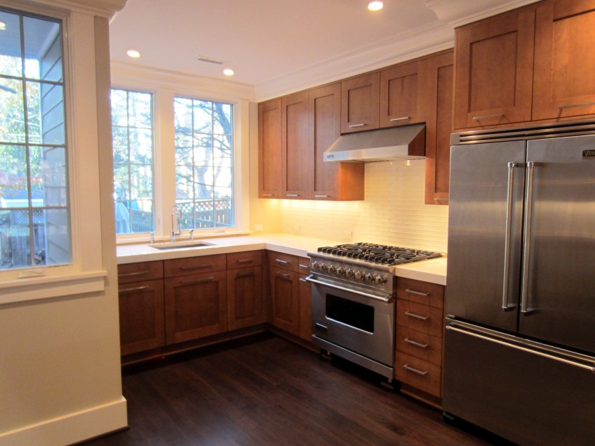
We only had a few pictures of the kitchen before (other than party pictures, which are included in one of the earlier posts reference above), so there’s not a great alignment with the before and after pics in this area (plus, the space for part of the kitchen didn’t even exist before the renovation . . .).

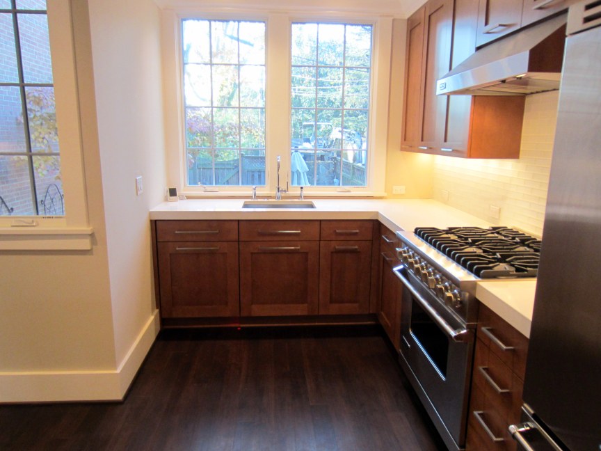
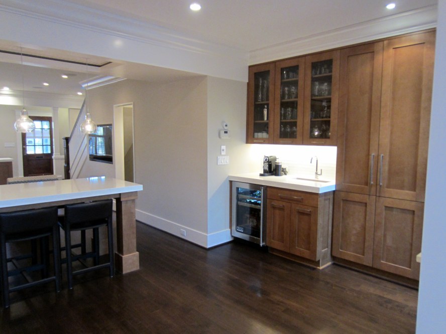
The kitchen after the renovation:

Before:

After:

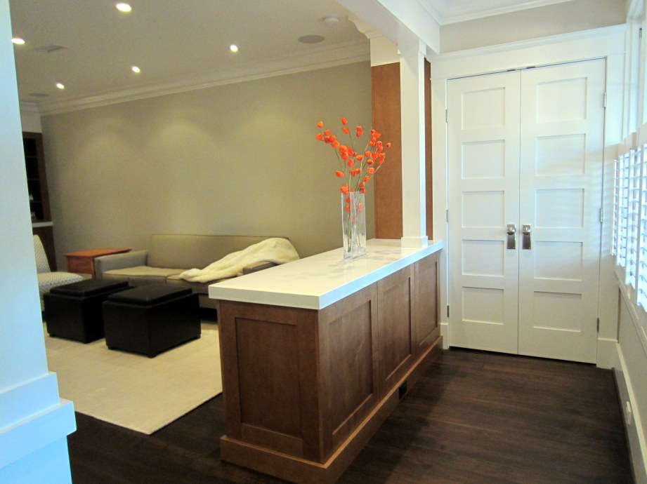
The new vestibule and much-appreciated coat closet:

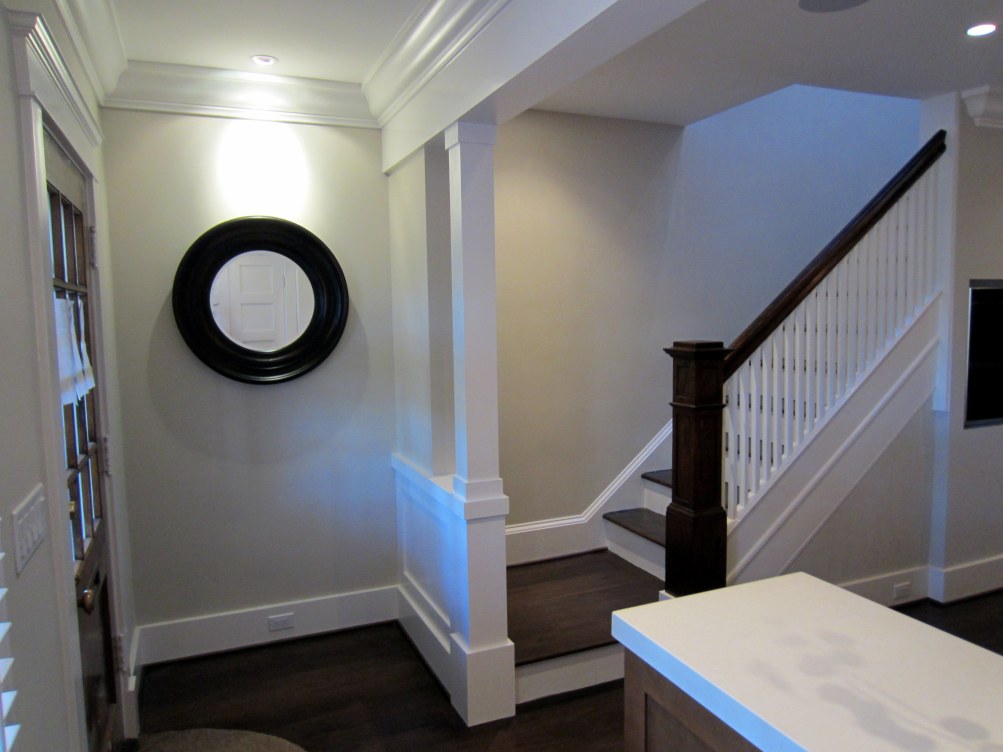
New landing at the bottom of the original staircase (the only element of the original house retained during renovation):

A view of the split, five-panel powder room door from the top of the basement stairs is below.

Resting on the radiator are a couple of signed plinth blocks. Dave, our Master Carpenter and site foreman throughout the project, and Freddie, Dave’s primary carpenter during the project, signed the blocks for us one day when they were addressing some punch list items:

Dave and Freddie did great work, and the WolfeStreetProject would not have been a success without their skill and craftsmanship. The finish carpentry work and overall fit and finish of the entire place is flawless because of these guys.

Aside from the changes in the overall appearance of the space, there are a multitude of infrastructure improvements that were able to be implemented by taking the whole space down to the bones. These include under-floor hydronic heat on the first floor, updated plumbing, electrical, and mechanical, and integrated AV to eliminate all exposed elements from view, other than the TV. (As you’ll note in a few of the dining peninsula pics above, a black metal grill that we had fabricated worked perfectly in the space under the massive slab o’ quartz to hide the subwoofer.)

 
7 Comments

Posted by on December 2, 2012 in Design


Before and After – Second Floor

The second post to bring closure to the WolfeStreetProject addresses the end result of renovation on the second floor. Before and after photos are presented below; some posts early on in the project documented the demolition of the upper floor (and discussed some of the discoveries of the original house that had been concealed for decades):

Before demolition actually began, we had developed a plan with our architect for transforming the second floor space. When there was a debate about whether we had the space for two bathrooms, Ben asked a great question: “So, let me get this straight, Kevin, you all wake up, Lisa heads to the shower on the second floor, and you head down two flights of stairs to take a shower in the basement?”

The design, including the addition of a second bathroom on the second floor, became pretty clear after that.

The floor plans for the before (bottom) and after (top) designs for the second floor are presented below.

Before and After Second Floor with Notes v2

Unlike the design goal posts for the first floor, we didn’t blog about the goals for transforming the second floor. However, a walkthrough of the second floor during framing, when a visiting building inspector from Pennsylvania was in town for a half marathon with Lisa, provides a brief summary of how the space would be used:

Although we had plenty of unforeseen issues and a few design changes along the way, the trauma and stress of the WolfeStreetProject definitely paid dividends – our design goals and functional living space aspirations, remarkably, were all met. One of the greatest additions (actually, a subtraction) by our second architect, Natalie, was the removal of the linen closet in the stairwell, noted by the red X above.

Presented below, with minimal commentary, are before and after pictures of the second floor to provide a view of the final product.

Master bedroom before:

IMG_2315

IMG_2087

IMG_2091

And, after (the renovation to this space included a 5′ bumpout to the south, a new bathroom, walk-in closet, and en suite washer / dryer):

IMG_4265

IMG_4266

IMG_4267

IMG_4268

IMG_4270

IMG_4272

IMG_4273

IMG_4275

IMG_4276

IMG_4278

IMG_4280

Guest room and second-floor bath before:

IMG_2307

And, after, including Natalie’s brilliant idea to demo the linen closet (RIP, narrowest 5-panel door in the world . . .):

IMG_4261

IMG_4180

Guest room before and after:

IMG_2312

IMG_4184

IMG_4187

IMG_2310

IMG_4182

IMG_4183

Second-floor bath before:

IMG_2296

And, guest bath, after:

IMG_4178

 
Leave a comment

Posted by on November 27, 2012 in Design


Wining and Dining: Opining on Design Refining

It’s now mid-November, and the house is basically done. We moved back into the house at the end of August, but stopped posting because we hit the 90% completion point, and most of the changes since have been incremental, and less dramatic than earlier stages of the project. We’ll be posting pics of the completed house after the Thanksgiving holiday festivities (and the annual Thanksgiving Eve party), but did want to post one update before then – construction of the dining peninsula.

As noted in the first floor design post, one of the objectives of the open-plan first floor design was to eliminate the dining room (which we rarely used, and simply walked around each day) and replace this with a dining element that would better support how we live and how houses these days generally function, from a social perspective. Namely, an area that explicitly accommodated guests aggregating in the kitchen, which is where everyone ends up, regardless of intent.

The overall vision for the peninsula is presented in 3D below, from our design work with Ben in 2011, before renovation actually began (check out the crazy thin-ass crown molding!):

In a photo from August 2012, after cabinets have been installed, but before the peninsula itself, we clearly maintained fidelity with the design:

However, reaching this stage prompted some serious work – we needed to figure out how to insert and support a 600-lb slab of 2.5″-thick quartz counter top into the picture. The actual mechanics for doing this were never really addressed during design, so the time had come to tackle this challenge.

The first action was, as always, an excellent drawing from Natalie. Just like with her bulkhead detail, this helped establish the parameters for everyone.

Her sketch below described the relative relationship of all elements for the parties involved – the GC, a custom metal fabricator we hired, and the counter top purveyor. The design on the top portion of the sketch addresses the relative position of the metal frame to the edge of the counter top – one side will extend farther than the other to allow for a 3/4″ overhang on the living room side of the peninsula, consistent with the overhang on the fireplace counter top on the other side of the room:

The next step was to install the peninsula legs, which would need to integrate with the metal frame, and support half the weight of the quartz. The 6″ x 6″ legs were fabricated by our kitchen cabinet maker and installed by our awesome carpenters with the GC – Dave and Freddie. The guys cut holes in the protective floor covering, measured the inside openings of the legs, and cut blocking and bolted these into the floor to serve as the foundations for the legs:

The next step (I think we’re up to Step No. 3, now), was to work with the metal fabricator to design and fabricate a metal frame that would be secured to the brick wall on one side and our new peninsula legs on the other, to support the counter top. (As Alexandria residents, we’re pleased to report that we were able to source everything locally – the metal fabricator, the counter top purveyor, and the GC are all local Alexandria businesses.)

Unlike most counter tops, which are supported along their entire lengths by underlying cabinets, our dining peninsula counter top would need to span an unsupported 6.5′ chasm – and not crack. The metal fabricator’s plan for the metal framework that would support the slab is provided below. The yellow elements are the steel frame; the red (pink? puce?) elements are cabinetry (cross-section of the apron on the bottom left and cross-section of a leg on the bottom right – obviously in different scales):


As you’ll note in the sketch above, one of the elements was the inclusion of tabs off the frame. This would allow the wood apron to be installed by the GC.

On the appointed day in August, the fabricator arrived and successfully installed the steel frame. It’s bolted into the masonry of the West wall on one end (it just “kisses” the cabinet below, in the parlance of the firm’s owner) and into the legs on the other end:

They used a “laser” to level the frame – Dr. Evil would be proud:

Note the void in the cabinet against the wall in the photo above. This will be filled by a subwoofer, and a grill will be installed in the cabinet frame to conceal this AV element, but still allow its sonic contribution to our music and video experiences.

The metal fabricator’s mission has been accomplished. Now, to trim out the elements. In the photo below, Freddie installs the cabinet baseboard to each of the legs:

In the photo below, the maple apron (mapron?) has now been installed around the circumference of the frame.

IMG_4095

Now for the counter top design:

Counter top arrival day: the guys from our local counter top firm (they also did our old kitchen, as well as the radiator top in the old living room) arrive to haul in the big-ass slab of dining peninsula goodness.

The three guys had a hell of a time with this mother. I thought I might need to give one of them my hernia doctor’s info at one point.

Just slide that baby in, and we’ll all be good:

Fantastic! Looking good:

Um . . . wait . . .

This big-ass slab is 1″ short!

So, here’s the deal: something went awry with the measurement and templating, and our honkin’ slab o’ quartz is, literally, 1″ short of the proper length. Luckily, our counter top firm was (as all Alexandrians are) completely awesome and responsible. We discussed the issue, and they removed the slab and started over.

Counter top delivery, Part Deux:

Hernias averted – four guys this time.

The slab fits, and the guys epoxy the quartz to the frame to create a bond that will enable the two elements to become one, and avoid crackiness.

The result was perfect. This outcome, as well as a broad range of other elements in the finally renovated domicile will be posted after Thanksgiving.

Connell fam, Quicks, Florida Connells, Thomas, et al. – see you in a few days for the Thanksgiving Eve feast-o-rama on Wolfe Street!

 
1 Comment

Posted by on November 18, 2012 in Design, Kitchen


Kitchen Design Crosses the Finish Line

Starting last fall, and throughout the renovation activities to date, we’ve been working with a kitchen designer and our architect(s) to refine the overall design of the kichen initially outlined in our renovation plans. This process continued moving inexorably towards a final design, but ongoing changes–both major updates and minor tweaks–resulted in multiple delays in placing the order for the cabinetry. One of our friends warned us that the kitchen cabinets would be the longest lead-time item in our project and he was certainly correct.

As a result of our delay in ordering the cabinetry, which has a 10-week leadtime, our move-in date now looks like early August instead of mid-July. We’re working with our kitchen designer to try to accellerate this by moving our order further up in the cabinet-maker’s queue, but it’s a crap shoot, and we may not be back in the house when we wanted to be.

The original floor plan for the kitchen is shown in the before-and-after sketch below. As indicated in the sketch, much of the working kitchen area (sink, oven/stove, and refrigerator) would exploit the new, 5′ x 8′ bumpout at the rear of the house:

Additional detail on the floor plan for the kitchen is in a subsequent sketch in the master plans. A couple of changes from the sketch above are evident here.

  • The kitchen sink, originally centered on the west window, would be centered between the two windows, which is what we wanted to do originally, but could not figure out how, due to the sink size and cabinet size. Our kitchen designer effectively addressed this.
  • The wet bar trough sink, originally placed on the north end of the wet bar counter in an east-west orientation, is now placed on the south end of the counter at the back, in a north-south orientation. There are several reasons for this change. First, we moved the wine refrigerator under the wet bar to the north side of the wet bar to avoid having a thin panel enclose it (it’s now optimally situated between the powder room wall and wet bar cabinetry). The sink can’t be located on top of this appliance, so it swapped places. Second, we wanted to maintain as much functional use of the counter space as possible, so we moved the sink to the rear of the counter.
  • Although not technically part of the kitchen, we also moved the sink in the powder room by the time of this sketch, since it originally was located against the brick exterior wall, and we didn’t want more pipes exposed than was absolutely necessary.

One other item that still appears on the kitchen floor plan above that has since changed (and is not necessarily evident from the elevations below), is a second faucet-type item that appears next to the wet bar faucet (labeled J and K, above). As designed, this was to be a much-anticipated beer tap for kegs stored below in the basement in the repurposed refrigerator from our old kitchen. Unfortunately, at some point in April, we realized that the length of the beer line from the basement to the tap was too long to be air cooled and the other alternative–glycol cooling, used in commercial applications–was way too expensive. Half of our household became despondent and almost apoplectic with grief over the loss of this key renovation design element. The other half just couldn’t stop grinning gleefully about the death of an idea that had been objected to from the start.

The situation was not at all unlike the reactions of Ralphie’s parents upon the demise of the fishnet stocking-clad leg lamp (“a major award!” in “A Christmas Story”). One party loudly bemoaning the loss, the other quietly smirking in satisfaction.

Enough on the floor plans and the sad death of one guy’s simple dream of having draft beer at his wet bar. Moving on to the kitchen elevation drawings detailing what, at long last, we’ve decided to do here.

First up is the west wall of the kitchen, where most of the cabinetry and several key appliances will reside. As originally designed, our plans called for a 30″ stove top nestled within the counter, and a separate wall oven below, ensconced in cabinetry. We really dig the look of these components as integrated, built-in pieces of the kitchen.

However, as we looked at different appliance options for these components our eyes would continually wander, lustfully, to the big-ass 36″ stainless steel ranges. We tried to maintain fidelity to our original choice, and tear our eyes away, but we ultimately succombed to our desires and redesigned this area of the kitchen around a 36″ stainless steel behemoth. We both are passionate about cooking, so we’re rationalizing this deviation from the plan by planning for the multicourse meals we’ll be making after we move back in again, with multiple pots and pans on the 6-burner stove.

Other components on the west wall include a counter-depth refrigerator (the dimensions in the elevation are correct, but the actual unit will have equal-sized French doors on top and a freezer drawer below). To the right of the refrigerator, located in the larger of the two cabinets, is a microwave. The door in front has a power assist, which is pretty slick – you just touch it and it moves out and up.

The dining peninsula/huge kitchen work space is the last item to the right. The bulkhead above helps define this area, as does the large, single piece of cabinetry above the table/counter on the west wall.

The cabinets themselves will be frameless with maple doors in a “praline” stain to contrast with the dark walnut floors below, and the white quartz countertops above. A photo of the sample we’ve been obsessively carrying around with us is below:

We considered doing painted cabinets in a taupe/putty color, which would have looked awesome with the chocolate floors and white quartz counter tops, but the old kitchen had painted cabinets, and we’ve seen the effects of use on corners and around the pulls and knobs, so we wanted something that would withstand abuse a little better. We chose maple because of the minimal grain; the stain gives the wood a nice neutral quality. The wide rails and stiles of the cabinet doors, shown in the sample above, gives the cabinets a “Shaker-style-on-steroids” look that we like, and will also be consistent with the clean lines of the rails and stiles of the passage doors throughout the house.

On the south wall will reside the other components of the working aspect of the kitchen (versus the eating aspect at the peninsula and the drinking and storage aspect at the wet bar / pantry area to the east). In the elevation below, the sink is centered between the two kitchen windows (the faucet will be, as well, even though this drawing does not show this). To the right is a panelized dishwasher (one of the minor changes we made during our continual rescrubs of the kitchen design was to replace a full-sized panel with a panel and drawer front to make the dishwasher further blend in with the other cabinets). To the right of the sink cabinet is the trash drawer, with two bins (one of which will now receive way more beer bottles than planned, due to the demise of the beer tap dream . . .).

The wet bar and pantry area is along the east wall, essentially where the old kitchen was. As noted above, the wet bar will include a wine refrigerator on the left and a sink on the right. The wall cabinets above, where wine glasses and other glassware will be stored, will help define this space as different than the rest of the kitchen, since they’ll have glass doors.

The wet bar isn’t just for der drinking; our espresso maker and kick-ass aerocino machine will be located here, as well, and coffee cups will be stored above with the glassware. (We’re still going back and forth about whether we should have frosted glass installed here, instead of clear glass, for this reason. Our architect thinks the clear glass would be better and that we shouldn’t worry about the coffee mugs. Let us know if you have an opinion one way or another.)

One of the last items we changed in the kitchen design (that cost us another few days in delays, but was totally worth it), was to add a drawer to the wet bar area. Up until a week ago, the design simply called for double cabinet doors under the counter. We realized that there was no where to store cork screws, bottle openers, tooth picks, etc., and made the change before it was too late. The drawer itself will be shallow (9″) because of the trough sink at the back, but there will be plenty of room for what we’ll use it for.

The cabinets to the right provide a pantry area. The right half of the southern-most cabinet will have full length access to store brooms, etc., and the cabinet doors there will be joined to open as one.

The end of the kitchen cabinetry at the bulkhead will be defined by a built-in bookcase of the same maple. The cabinet below the peninsula (and behind the bookcase) is difficult to access, and so became the perfect location for the subwoofer for the living room’s AV system. The space already has been wired by our AV consultants, and by the GC’s electrician to accommodate this audio component. Rather than a wood door, we’ll install a metal grill to the front of this cabinet (facing the length of the dining peninsula).

The bookcase at the end of the kitchen will, in the parlance of our first architect, “talk to” a twin bookcase across the living room. As a result, the bookcase and knee wall cabinetry at the front of the house will be identical to the cabinetry in the kitchen. These bookcase elements will be both functional and are critical design elements that define the living room space. A floor plan view of the entry knee wall and bookcase is below.

The elevation drawing below shows the north bookcase and knee wall cabinetry, in the middle of which will reside a gas fireplace.

 
4 Comments

Posted by on May 13, 2012 in Design, Kitchen


Transforming the First Floor – Goals and Design Plans

After the second floor was framed up, the guys began framing the first floor. Not nearly so much involved here, inasmuch as our design goal was an open floor plan. Before we get to the update on first-floor framing, it would be helpful to describe our design goals here, since they will completely transform the space.

The goal of the first floor design was to recreate the house to reflect how we live. We don’t do a lot of sit-down dinners in the dining room, but have friends and family over quite a bit. They all make a beeline to the kitchen and hang out there or in the back patio. On a day-to-day basis, our routine involves cooking in the kitchen and hanging out in the too-small living room, notably skirting the unused dining room as we move between the back and front of the house. This made no sense.

To provide the context for the limitations of the house “as-was” and the intent of the renovation, the “Before” and “After” designs of the first floor are pasted below (arranged in a regrettably non-intuitive order):

As shown above, in the lower, “Exist’g First Floor Plan,” there were elements that made sense in 1925, but weren’t working for us. These elements included the following:

  • The entry from the porch poured directly into the living room, without any transition
  • The lack of a coat closet on the first floor (there actually was one in the original house, and many of our neighbors still have theirs). In the 1990s, the owners demolished this closet (but not the closet door) to create a hallway between the front of the house and the kitchen (a traffic pattern we liked quite a bit, but it did come at the cost of coat storage for us and our guests when we entertain). You can see the closet door in the Existing Floor Plan drawing below, and in line with, the wall separating the dining room from the living room.
  • A dining room we didn’t use (but in which lived our beloved cherry dining room table, which now has found a new, awesome home at Stephanie and Eric’s down the street; we have visiting rights)
  • No fireplace. We totally dig our wood-burning, glass-melting, kick-ass fireplace outside, but have always wanted a fireplace inside.
  • Kitchen space that didn’t take full advantage of the back of the house – the southeast corner was basically a dead area
  • A kitchen island that everyone always gathered around when we had people over, but that was too small for both entertaining and cooking (which we would typically be doing at the same time). As seen in some of the “Before” pics in the Kitchen Demolition post (https://wolfestreetproject.com/2012/02/10/kitchen-demolition/), we also had kitchen cabinets over the island, which hung down at eye level. As a result, you could quickly tell who was having conversations across the island because they’d be bobbing up and down and back and forth like sparring partners in a boxing ring to look at each other around and under the cabinets. Another view of the hanging kitchen cabinet conundrum is seen here, from preparations for the rockin’ 2009 Thanksgiving Eve Party (which ushered in the now-hallowed tradition of stoking the outdoor fireplace so hot we can melt beer bottles):

All right – enough of the old house layout nostalgia. On to the new house.

As seen above, in the “Proposed First Floor Plan” drawing, the renovated space will have no dining room. But wait – that’s not all!

Included with this special house renovation offer are the following additional features – but only if you act now!

  • A small entry vestibule that provides a transition from the front porch to the living room; the foyer is defined on the bottom by custom cabinetry that forms a knee wall and on the top by a beam above. This design approach defines the area without enclosing the space, which would be crazy in a house this size. Plus, the cool knee wall serves another purpose . . .
  • An open-faced gas fireplace (http://www.sparkfires.com/products/vent-free-3ft) that will live in the knee wall. (More on that when we get to mechanical elements of the house reno, as well as installation of quite a bit of cabinetry.)
  • A coat closet (woo hoo!) at the east end of the narrow vestibule
  • Reorientation of the living room to have furniture along the east wall, rather than in the middle, as we had previously, due to the AV components being installed below the stairs. Some friends have called the new living area a Great Room, since it will be much larger than our previous, too-small living room. But, let’s be clear – this is not palace on a postage stamp in the suburbs; we’ve got a small townhouse in Old Town. There’s no way we’ll have a Great Room. So, we’ve dubbed the new room a Good Room . . .
  • A combination kitchen counter / dining area that serves as a transition between the Good Room and the kitchen. We’ll be able to use this for additional food prep space during parties, but also for food service during the same, and for dining when we have friends over for a casual dinner. It also, most importantly, will serve as an ideal gravitation point when friends and family drop by – a superior solution to the head-bob-inducing kitchen island area.
  • A larger kitchen (thanks to the bumpout) with more counter space
  • A wet bar with wine cooler below and beer tap above (with a line to the repurposed refrigerator in the basement)

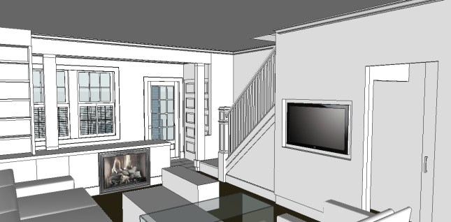
All of this is manifested in the 3D renderings of our new space below. (These were developed by our previous architect in SketchUp, a free, but powerful CAD/CAM package available from Google – highly recommended!)

This is a view from the new landing at the bottom of the stairs. The built-in bookcases on the right mirror another set at the front of the house at the end of the knee wall that defines the entry vestibule.

A niche will now house AV components, so the furniture can be located against and perpendicular to the east wall, opening up the space and allowing for enjoyment of the fireplace (which is to the left in this view). We’ve taken great pains to protect and preserve the original newel post and staircase, since these are the only remaining elements of the original house (and also served as grounding for the design of the house, so we didn’t get too contemporary, and tried to maintain fidelity to the original essence of the 1925 structure).

A view of the dining peninsula and bumpout kitchen. (The oppressive extent of cabinetry in the 3D rendering will actually be punctuated with stainless steel for the range and refrigerator on the right.)

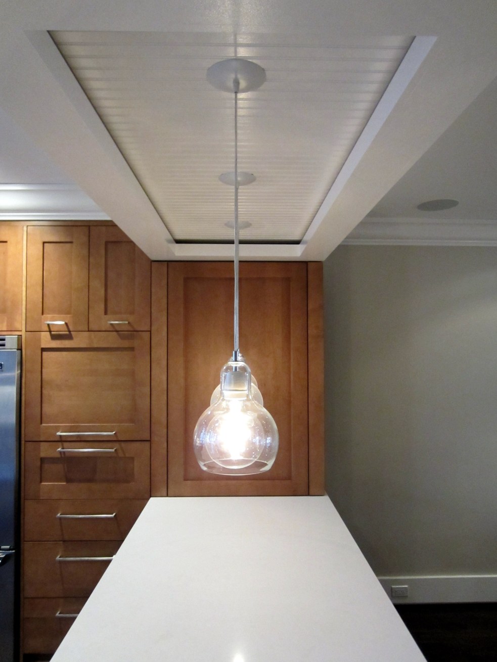
Um, we won’t be installing these light fixtures, but we are seeking cool pendant lights to hang from the bulkhead over the dining peninsula.

A view north from the kitchen. One of the many changes since this rendering is the reversal of the location of the wine refrigerator and sink / faucet at the wet bar. Also, although not evident from this rendering, the wet bar cabinetry and pantry (between the wet bar and door) will be the same wood and finish as the kitchen cabinetry.

Another view to the north and the Spark fireplace – and another change. The closet shown to the right of the door will not  be built. This was getting too cramped, so we’ll have a console table there. As with the wet bar and pantry area, the cabinetry for the bookcase and kneewall will be identical to the kitchen cabinetry.

The pocket door to the right leads to the powder room (holy crap, this is going to be tiny!) and the stairs to the basement.

 
2 Comments

Posted by on March 31, 2012 in Design


The Project Begins

After more than a year of design, construction on the whole-house renovation on Wolfe Street finally began on January 31, 2012. Progress on the WolfStreetProject will be updated periodically on this blog.

Here’s the current layout and new design for the first floor:

Here’s the current layout and new design for the second floor:

And, here’s the basement – just excavations, here:

 
1 Comment

Posted by on February 2, 2012 in Design